Metropolitan Transit Authority
Brand Identity, March 2025 - CurrentAt the MTA, I work on informational and branding projects that exist in print, digital, and web formats. I learned how to integrate current design trends with the MTA’s brand. I faced the challenge of understanding my creative limitations while working on these projects.
Adobe Indesign
Adobe Photoshop
Adobe Illustrator
Adobe Photoshop
Adobe Illustrator
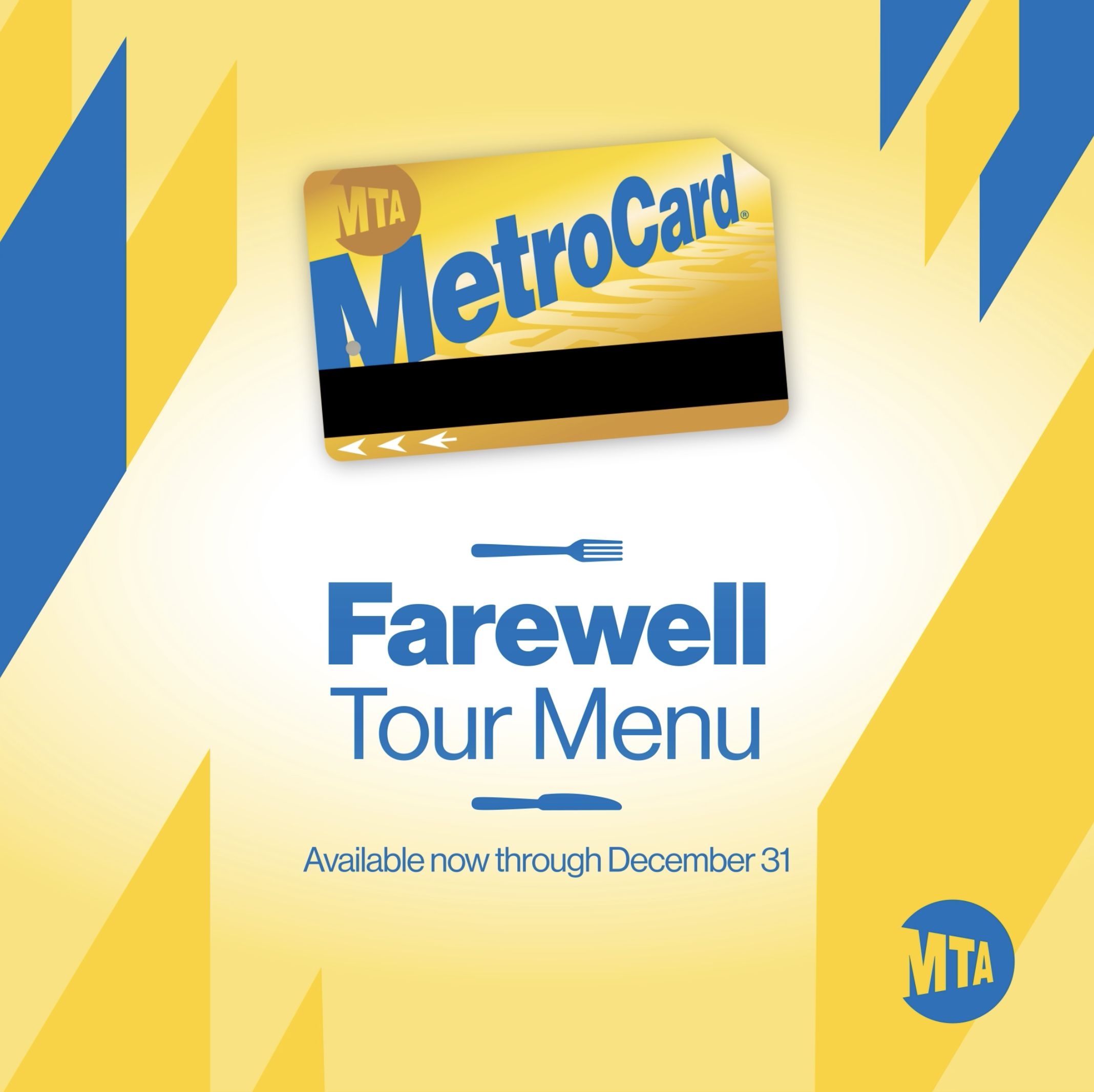
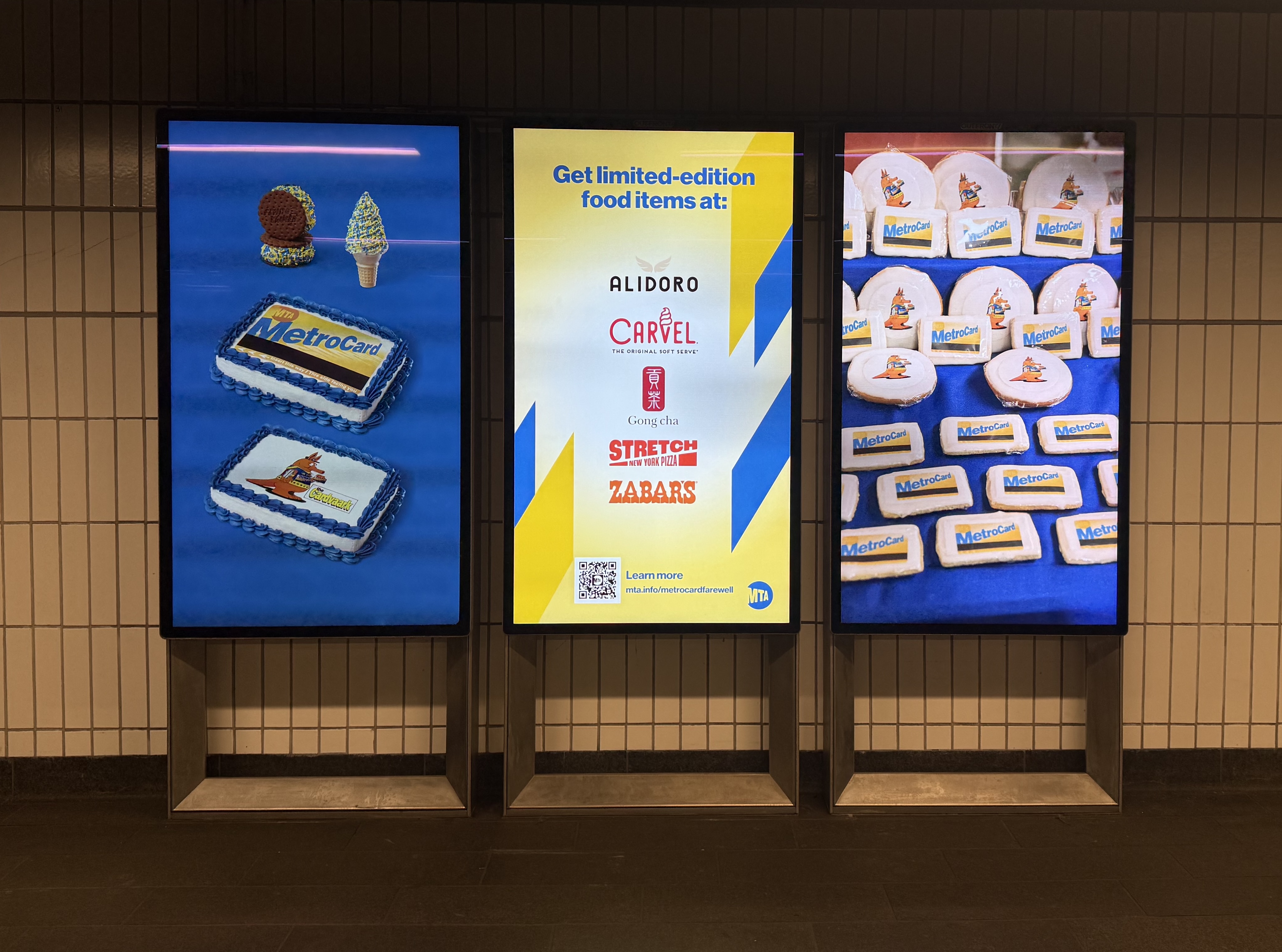
Farewell MetroCard Campaign
2025The MTA Farewell Campaign is a project in collaboration with food sponsors, celebrating the legacy of the MetroCard. This initiative marks the end of an era, bidding farewell to the iconic MetroCard while partnering with food brands to commemorate its role in New York City's transit history. I worked on a variety of assets from food wrappers, digital subway screens, and printed postcards. I learned to design in collaboration with a motion designer and illustrator. This project allowed me to see how a system of branding can be pieced together on different assets.
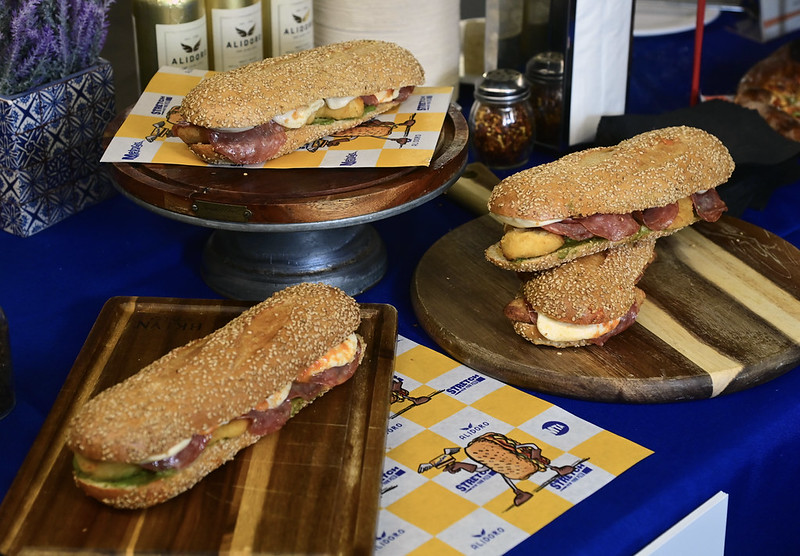 Sandwhich Wrapper
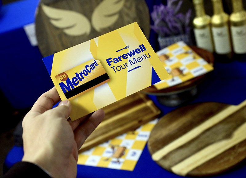 Postcard
Digital Screen Assets
 First frame
 Second Frame
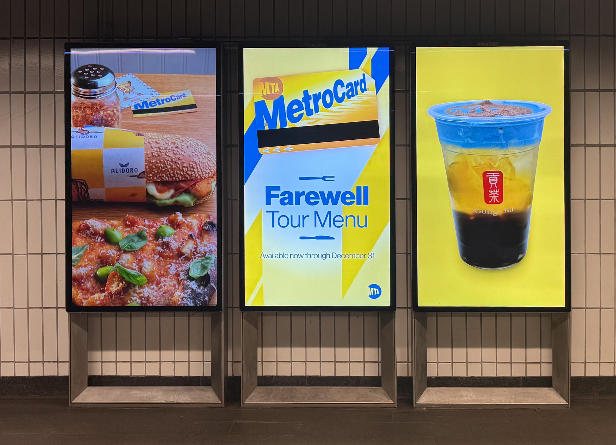
Triptych for the MetroCard Farewell Campaign
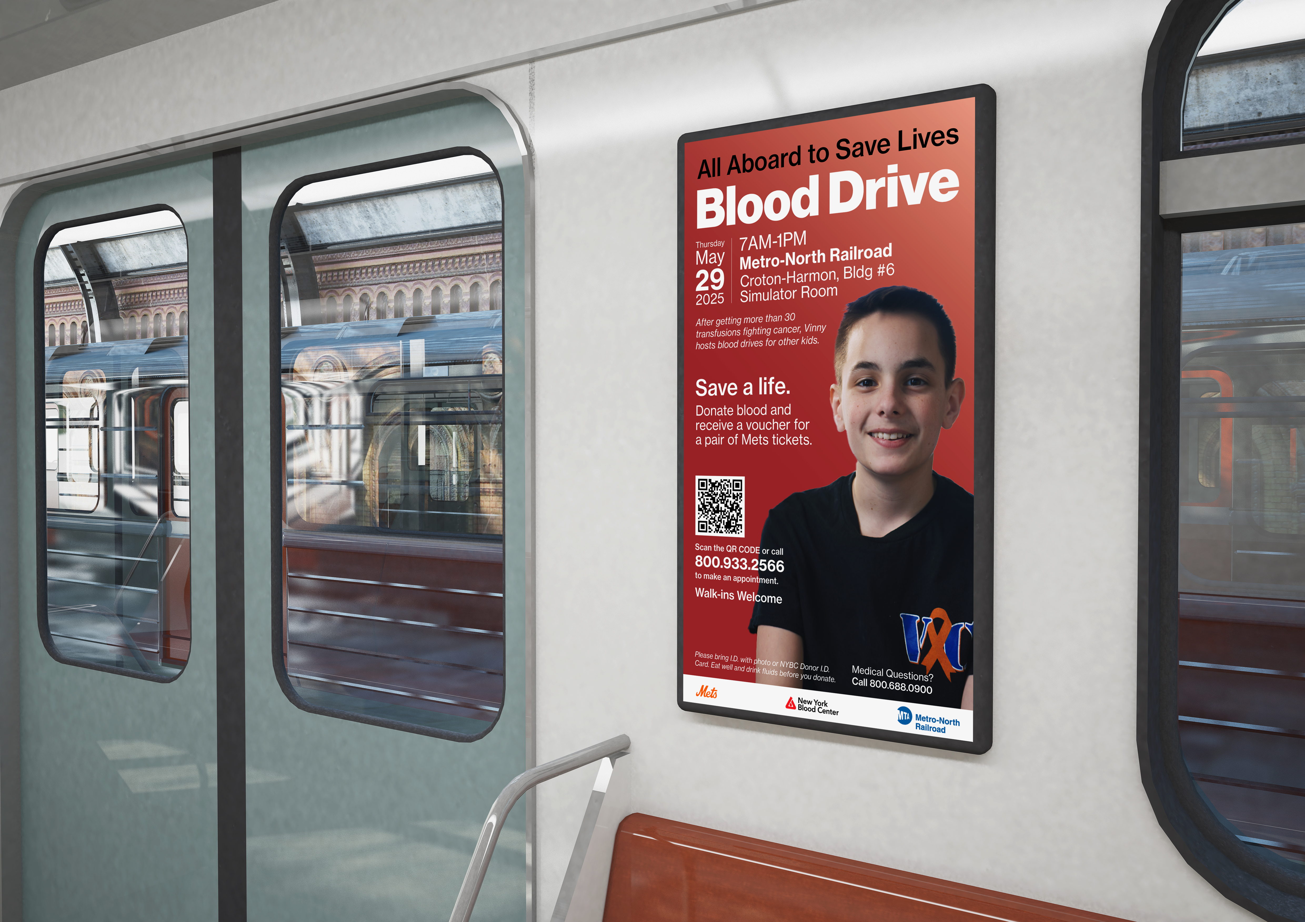
Blooddrive Campaign
May, 2025
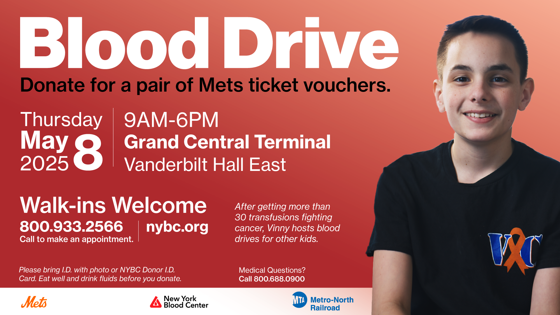
The MTA Blood Drive Campaign focuses on aligning design elements with visual medical themes. Blood drive campaigns are centered around the color red, I used this as a guiding principle for color choices and layout decisions. I was challenged to create a layout that has extra copy. I used a grid method and different hierarchies to create a comprehensive layout that is easy to read. As a result, the MTA achieved its highest blood donation numbers to date.
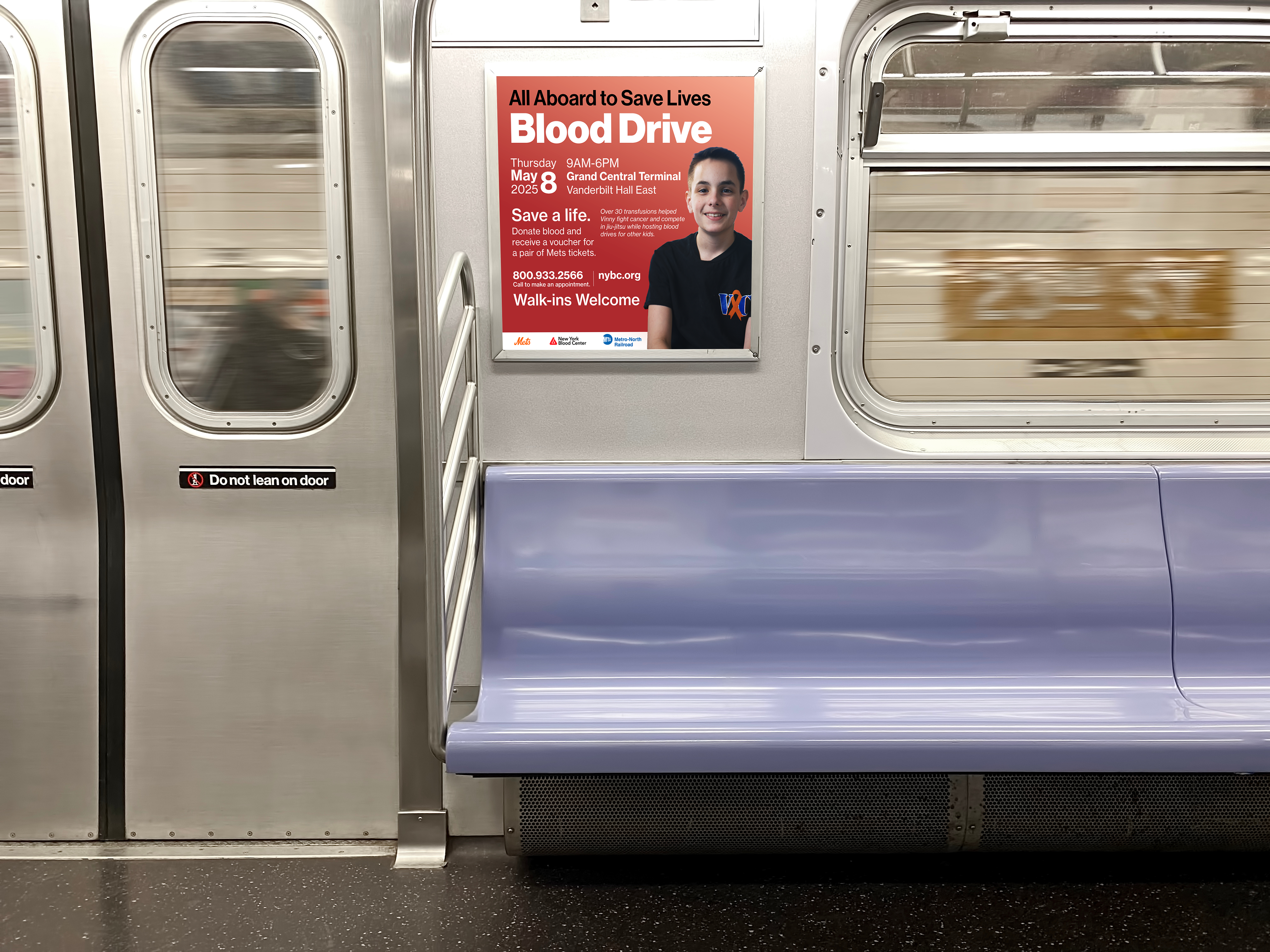
 ADV 1920x1080
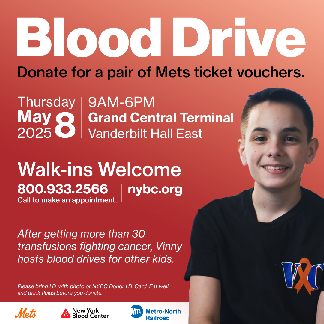
Premium Square 1080x1080
 Digital TV Screens 1920x1080
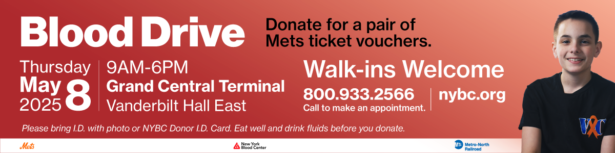 Train Banner 1200x300
Harlem Week Poster Design
2025
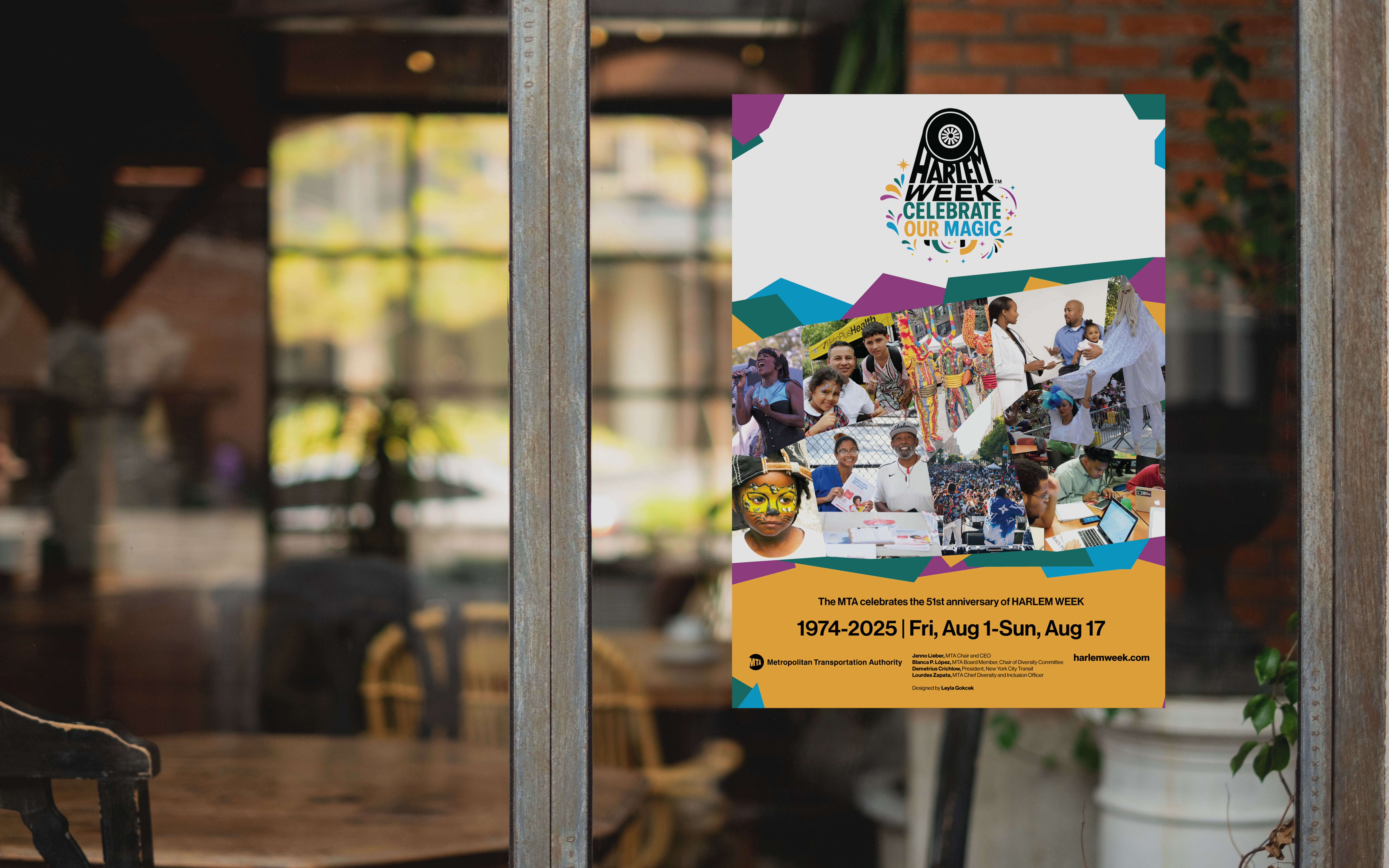
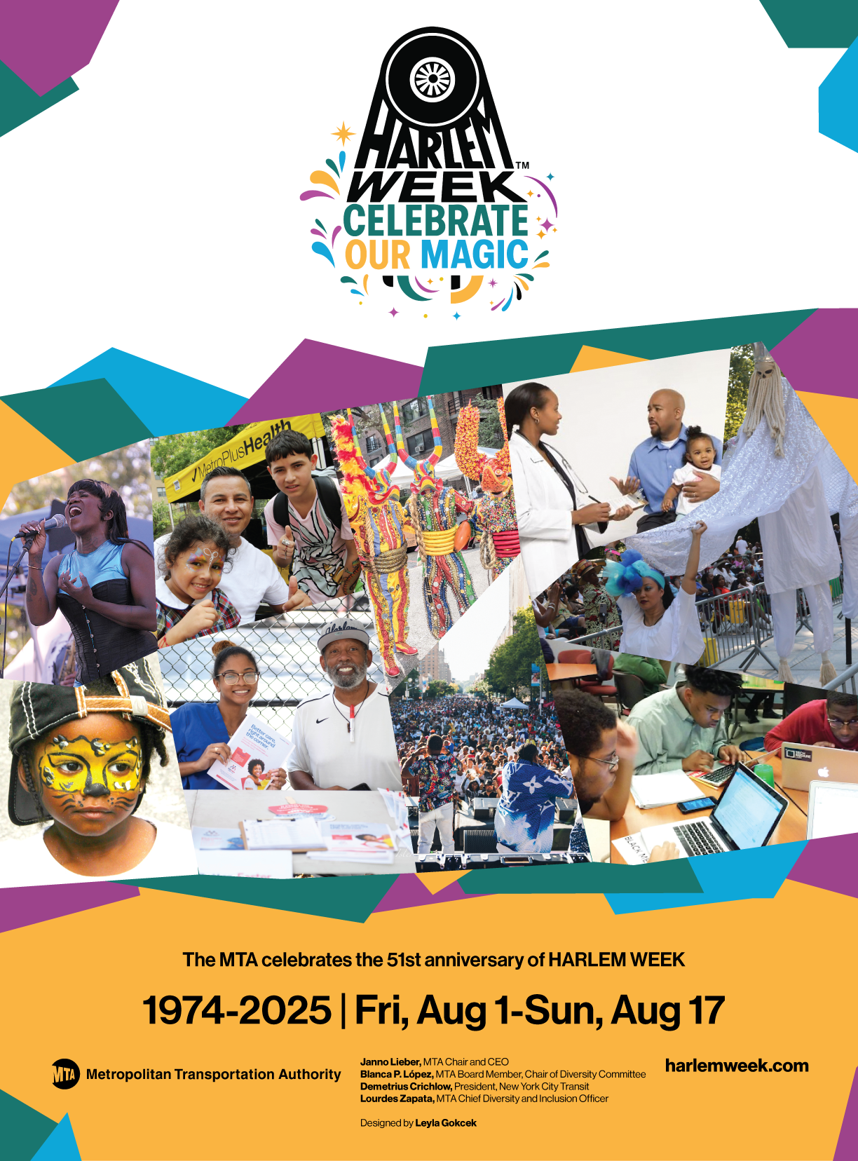
Harlem Poster Week is an annual tradition that the MTA participates in each year. This time, my approach to the poster was inspired by the vibrant jazz posters of 1950s Harlem. I wanted to honor the legacy of these iconic designs and the cultural significance they held in the neighborhood.To achieve this, I used shapes that resemble cut-out paper collages stacked on top of one another, layering them to create depth. I also incorporated the colors from this year's festival logo to tie it all together. The iterative design process allowed me to explore different versions of the layout, refining the final piece.
Harlem Poster Week is an annual tradition that the MTA participates in each year. This time, my approach to the poster was inspired by the vibrant jazz posters of 1950s Harlem. I wanted to honor the legacy of these iconic designs and the cultural significance they held in the neighborhood.To achieve this, I used shapes that resemble cut-out paper collages stacked on top of one another, layering them to create depth. I also incorporated the colors from this year's festival logo to tie it all together. The iterative design process allowed me to explore different versions of the layout, refining the final piece.
Process of the design:
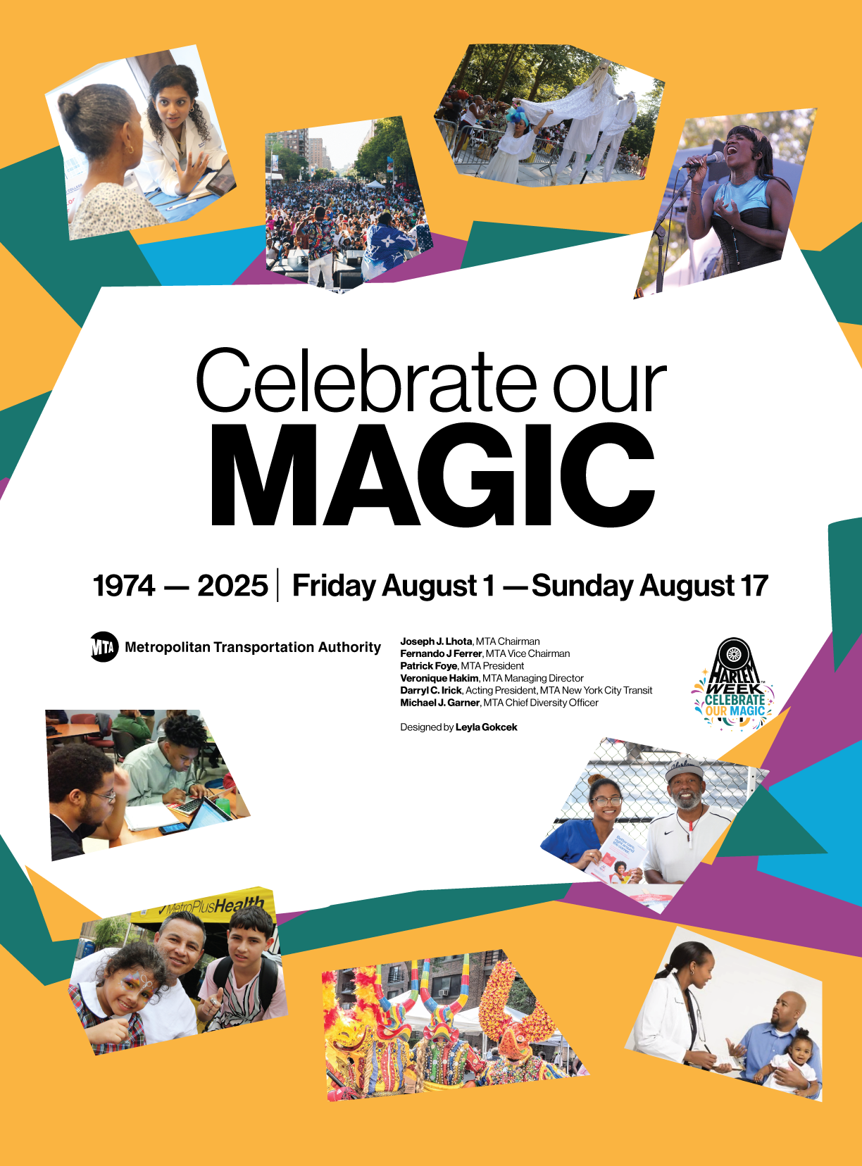 First iteration
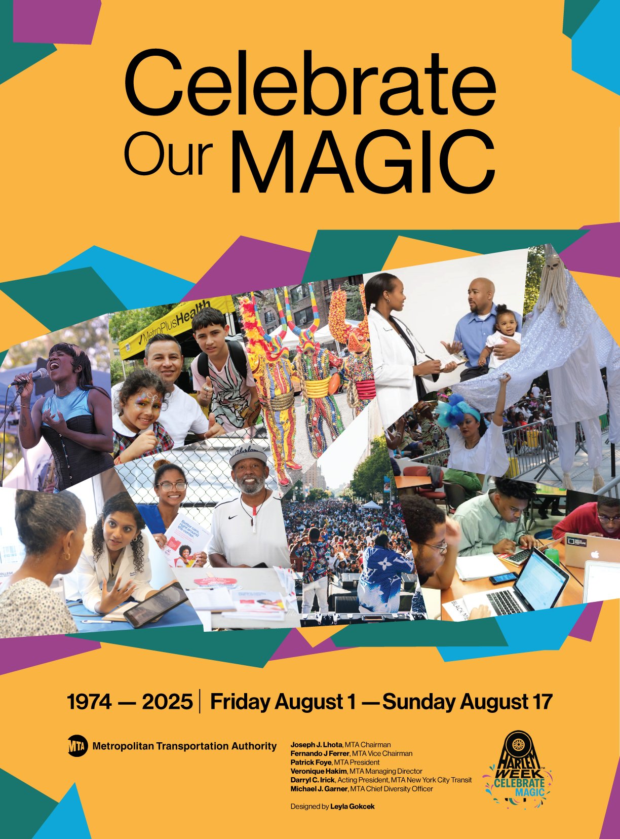 Second iteration
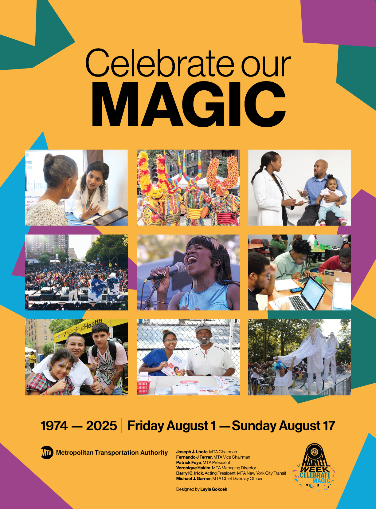 Third Iteration